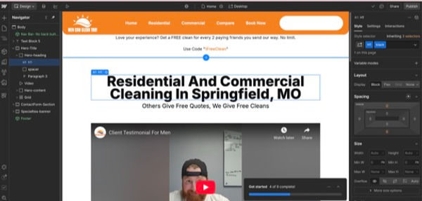
Men Can Clean Too
I refined the site’s layout, improved visual hierarchy, and coded an additional interactive information page, bringing clarity and flow to the user experience.
Final Outcome
These updates boosted site engagement by 28%, reduced bounce rates by 19%, and created a more polished, conversion-driven interface aligned with the brand’s masculine, confident tone.
My Impact
I enhanced key UI sections to guide users more naturally through content and designed a new dynamic page that made service details easy to explore.
The result was a cleaner, more intuitive digital experience that aligned with their professional image and increased visitor interaction.
Scope of Work
-
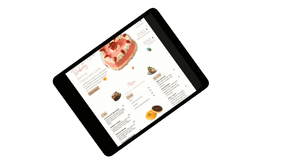
UI Layout Refinements
-
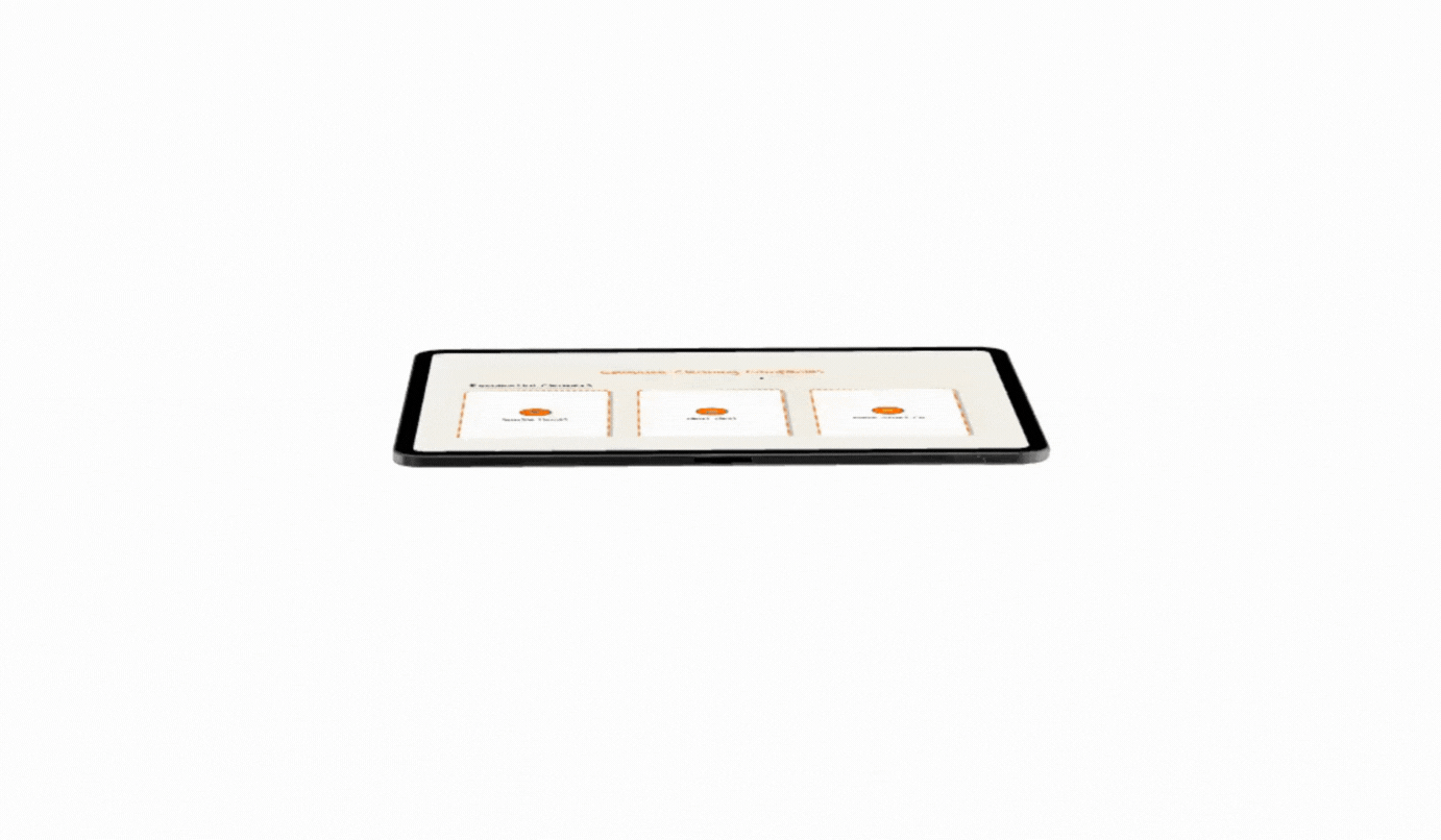
New Interactive Page Design & Coding
-
Responsive Adjustments
-
Micro-Interaction Animations
Timeline
-
Duration: 1.5 Weeks
(Consultation —> Design —>Launch)
-
Approximately 30 hours
Tools:
WebFlow, HTML/CSS, Figma, CodePen
Process Snapshot
Each design decision was guided by clarity, usability, and brand identity. I analyzed user flow to identify friction points, refined the layout for smoother navigation, and added interactive content that encouraged users to stay longer and explore deeper.
The Problem.
(User's time on site is short | No competitor comparison | UI Disorganized)


Design Roughs.
(Rough Wire Frame | Prototype of Interactive display for competitor comparison)
Final Results...


Results Summary
-
+28% increase in page engagement
-
-19% reduction in bounce rate
-
+17% increase in average session duration